
Art and math may seem like vastly different subjects, but in fact, they have a close relationship. Many of the concepts used in math, such as perspective, the rule of thirds, and the golden ratio, are important design elements to create visually pleasing and balanced compositions.
Art can be both beautiful and mathematically precise. Artists like Leonardo Da Vinci, M.C. Escher, Piet Mondrian, Paul Klee, Pablo Picasso, and Albrecht Durer used math heavily in their works. Angles, shapes, and lines lead the eye through their works.
Whether you are an artist, designer, or simply someone who appreciates art, understanding the mathematical principles behind much of the art that surrounds us can deepen your appreciation. Let’s explore!
Rule of Thirds
The rule of thirds is a way to make an image more interesting and pleasing to the eye. Think of a big square that is divided into a grid of 9 smaller squares. The big square is the whole picture and the 9 smaller squares are like the pieces of a puzzle.
The rule of thirds says that the most important parts of the picture should be placed along the lines or in the middle of the squares. The intersections of the lines are considered the most important parts of the image, and are the points where the eye is naturally drawn.
Placing key design elements along these lines and intersections creates a sense of balance and movement in the image, which make it more interesting and engaging.
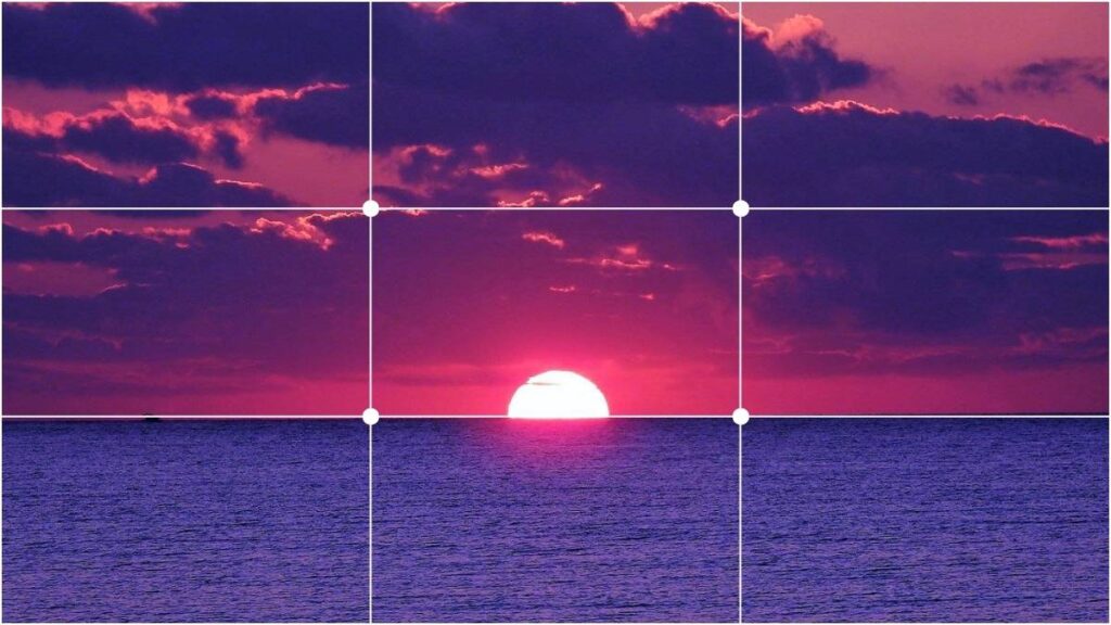
For example, if you draw or photograph a sunset following the rule of thirds, you should place the horizon line along one of the horizontal lines making your grid. This helps create a sense of depth and perspective in an image.
Also, if you are drawing a picture of a person, you should put their eyes on one of the intersection points, so the person’s face will look more interesting and you’ll be able to see their expression better.
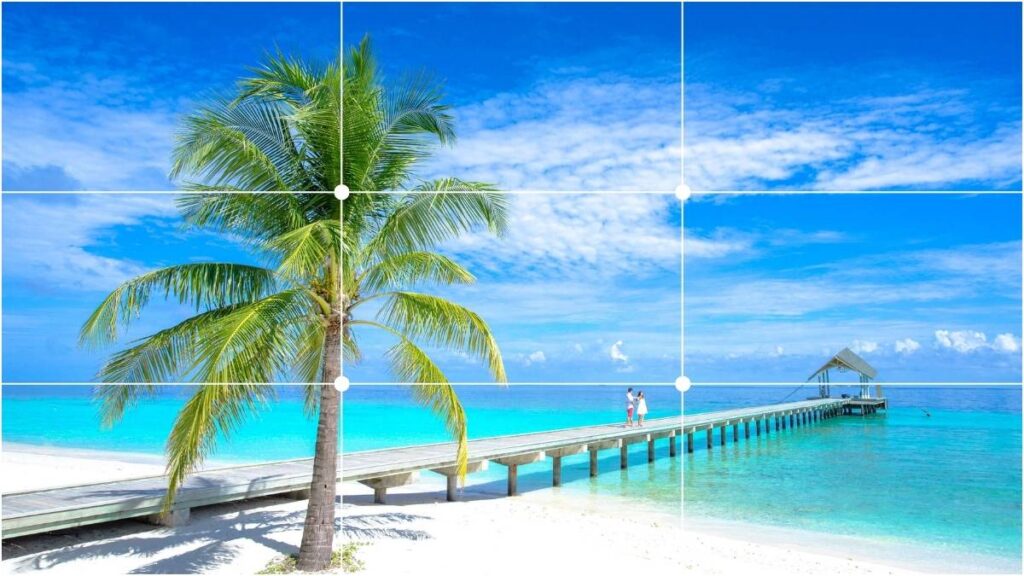
It makes composition like a game, you can try to use the rule of thirds when you take pictures or draw and match up elements of your image with the lines. Most digital cameras make this especially easy with a ‘rule of thirds’ grid overlay so you can line up your shots.
You don’t always have to follow the rule of thirds, however. There are other compositional guidelines:
Golden Ratio
The golden ratio, also known as the golden section or Fibonacci sequence, is a mathematical concept that has been used in art and design for centuries. It is based on the idea that certain proportions between parts of a composition can create a sense of harmony and balance.
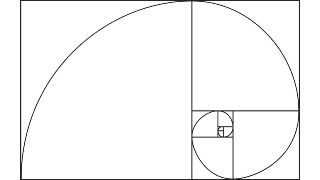
This proportion is equal to about 1.618, which can be found by dividing a line or shape into two parts, such that the ratio of the longer part to the whole is the same as the ratio of the shorter part to the longer part. Having trouble imaging it? You’ve seen it over and over again, without realizing it!
You can find the golden ratio in nature, like in the shape of a seashell or the spiral of a pine cone. And artist may take inspiration from this natural forms to create their art, and we can use this secret formula as well!
In art, the golden ratio can be used to create pleasing compositions by placing elements of the image in proportion to each other. An artist may use the golden ratio to determine the placement of the subject within the frame of a painting, or to create a sense of balance within the overall composition of a sculpture.
It’s like a magic trick that helps people make things look nice and balanced, and it’s used as a guide for artists and designers.
For example, if an artist is drawing a picture of a person, they might use the golden ratio to make sure the person’s head is just the right size compared to their body, place their arms and legs are in the right place for the composition
Or if a designer is making a logo for a company, they might use the golden ratio to make sure the different parts of the logo look good together. The Apple logo with the bite out of the apple uses the golden ratio.
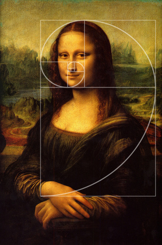
Leonardo Da Vinci’s Mona Lisa is one of the most famous paintings in the world, and makes use of the golden ration in its composition. You can see how the elements of the head and facial features align within the shape of the ratio.
Related post: Find out how to use these math concepts with us in our post with Art Projects that Use Math.
Geometric Shapes
Geometry can be used as an underlying guide for the composition of a piece of art, or it can be front and center as the main subject or design elements.
Geometric shapes, such as circles, squares, triangles, and other forms, are used in art as a way to create compositions that are visually interesting and harmonious. The use of simple, basic shapes allows for a focus on color, composition, and form, rather than on the representation of objects from the natural world.
In abstract art, geometric shapes can be used to create interesting compositions that explore the relationships between colors, shapes, and forms. Artists such as Paul Klee and Piet Mondrian used geometric shapes the main focus to create abstract works. (Paul Klee’s style always reminds me of Magnetic Tiles; just for fun, try making your own cubist castle on your refrigerator with magnetic tiles!)
Surrealist painter Salvador Dali used shapes as primary elements in many of his works. Take a painting like “Apparatus and Hand.” You can see the triangle shape repeated in the wedge and cones, as well as placement of other elements within the painting

Geometric figures are prominent in may of Pablo Picasso’s works. Check out the strong shapes in The Guitarist (or just about anything form his Cubist phases.)

Look at a painting like The Accolade by Edmund Blair Leighton, and you’ll see the evidence of a more subtle use of geometric shapes. Again, triangles are everywhere, and the lines lead the eye around the painting.
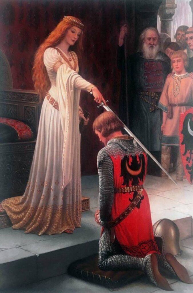
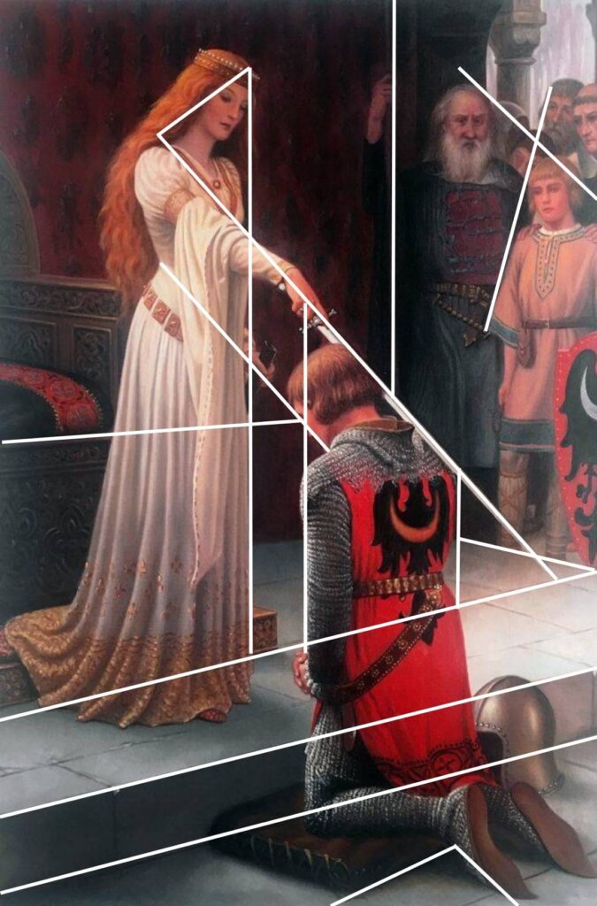
As an aside, we have a print of The Accolade in our living room. Laying on the couch one day with a bout of the flu, I once spent an entire semi-lucid afternoon staring at and studying this painting. The leading lines and angles are masterful, and even on a lazy day with a high fever, I learned a lot about composition.
Patterns
M.C. Escher uses patterns as a main theme and explores the mathematics of tessellation in a number of his works. For example, “Sky and Water” showcases Escher’s mastery of tessellation, which is the process of using repeating shapes without any gaps or overlaps.

This work is also a great example of transformation, which involves morphing one shape onto another. The shapes in the print, including the birds and fish, are transformed and repeated to create the overall pattern. The repetition of the shapes and the use of symmetry create a mesmerizing visual effect that draws the viewer in.
“Circle Limit III”, is another great example of M.C. Escher’s use of mathematical patterns. In this print, Escher creates a tessellation of fish shapes using non-Euclidean geometry, meaning the lines and shapes can bend and curve in a way that they wouldn’t in our regular world.

Andy Warhol was another artist who used patterns as a major design element. One of Warhol’s most famous techniques was his use of repeating images, like soup cans, Mickey Mouse, or Marilyn Monroe’s face. By repeating the same image over and over, he created a pattern, with bright colors creating visual interest and breaking the monotony.
Warhol created patterns that were both recognizable and visually appealing. This repetition also helped to emphasize the mass-produced, commercial nature of the images he was portraying. Warhol also used patterns through his use of bright, contrasting colors.
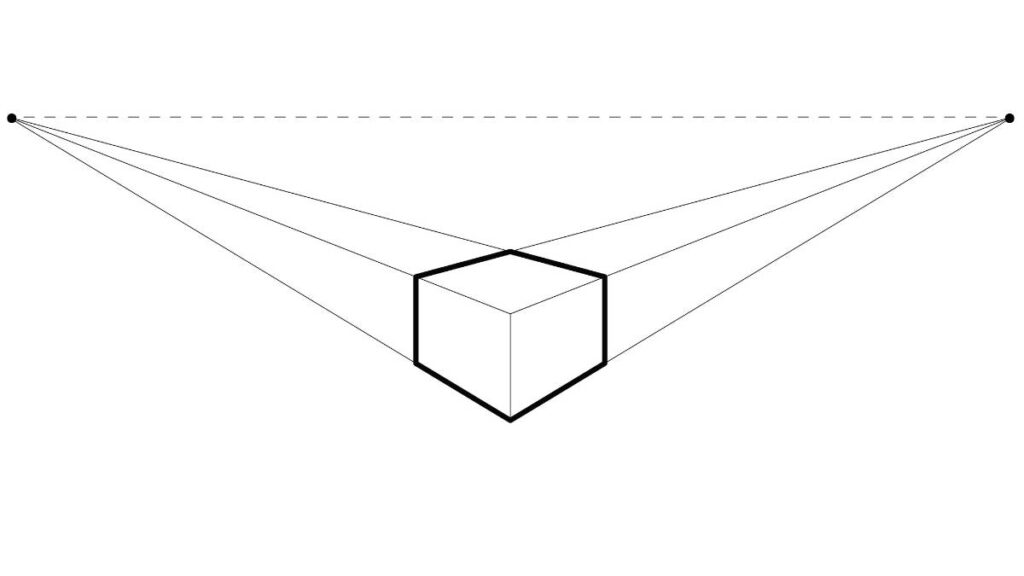
Linear Perspective Drawing
Linear perspective drawing is a technique used in art and drawing to create the illusion of depth and three-dimensionality on a flat surface, such as a piece of paper or canvas. It is based on the principle that objects in the distance appear smaller and less detailed than objects that are close up.
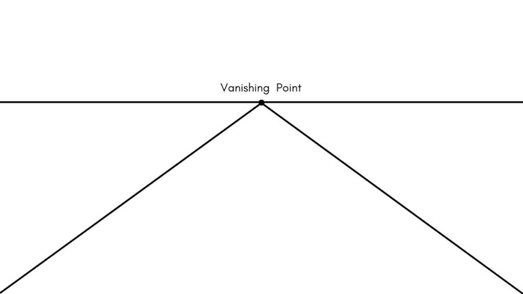
The basic idea of linear perspective drawing is to use a set of parallel lines, called “vanishing lines,” to create the illusion of depth. These lines are drawn on the flat surface and converge at a single point, called the “vanishing point,” which represents the point in the distance where the parallel lines appear to meet.
Think of standing in between railroad tracks and looking as they appear closer together as they approach the horizon line off in the distance. We know the tracks maintain the same distance (else, how could the train travel along the tracks?) We can confirm this by walking along the tracks; they stay the same distance apart, but appear closer together the further away we look.
To create an illusion of depth, an artist can use linear perspective by drawing objects in the foreground larger and more detailed than the objects in the background. They may also use the vanishing point to create the illusion of depth by making objects appear to recede into the distance, like the train tracks.
It is important to note that Linear perspective is a concept that was discovered and developed during the Renaissance period, and it was a revolutionary concept that changed the way art was made, it allowed artist to create more realistic and realistic paintings and drawings. Today it is widely used in painting, drawing, and architectural rendering, and is a fundamental concept in art and design.
Need some extra math practice? We’ve got some fun themed math worksheets in our printables shop. Check out the holiday themed worksheets, or grab some fun characters like dinosaurs or astronauts!
Wrap Up – The Art of Mathematics
Many people assume the orderly world of math and the creative space of art don’t mix – Iike it’s some sort of had and fast left brain vs right brain division. The truth is math IS art, and art NEEDS math. Look at some of the paintings on this page alone, and you’ll see shapes, patterns, and ways to divide a canvas. There are whispers (and shouts) of math concepts all through the history of art.
Artists use math; sometimes very purposefully, and sometimes because what looks most aesthetically pleasing just happens to fall into mathematical precision.
Next time you’re doodling, try some of these concepts. Next time you look at a logo, a drawing, a photograph, or advertisement try to spot the bits of math peaking through the art. Now that you know that it’s there, it’s hard NOT to see it.
Don’t miss our post about famous artists who use math, and find out why art is important in STEM and STEAM.
